ascolour: project story
There’s beauty and perfection in basic things: the smooth contour of a wall, the soft grain of wooden floorboards, even the way the light through the window changes the feel of the interior. So much pleasure can be received from a simple thing, and, above all, a simple thing done well.
In 2006, Lawrence Railton founded AS Colour in New Zealand, where they are still based. Now a global retailer, their organic cotton basics are renowned and respected, not only for their high quality, but for their ethical standing, too. Their cotton is responsibly and 100% transparently sourced, and they have a zero- tolerance position on bonded labour.
It came as no surprise, then, when Studio Hako was introduced to AS Colour by a mutual friend, that the two clicked together. Both ethically and sustainably minded, their uncompromising ideals combined seamlessly with a similar love of clean aesthetics, precise workmanship and attention to detail and finish.
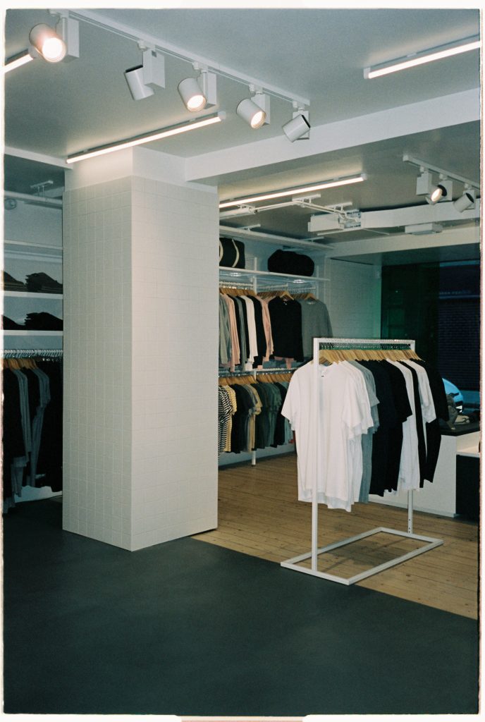
AS Colour’s inaugural UK store would be based in the sought-after Redchurch Street in Shoreditch, London. With both the owners and designer, Think + Shift, on the other side of the world, most communication went ahead via technology. They wouldn’t, in fact, come to the UK until the project was completed for handover, but it didn’t stop us quickly creating a firm bond over the months we worked together. They wanted a bright, fresh and minimal space, quite the opposite to how the shop’s predecessor, T2, had left it. Mostly black with a few orange details, it had a low ceiling, making an oppressive cave-like atmosphere. It was a pleasure just to restore some breathing space back into its walls.
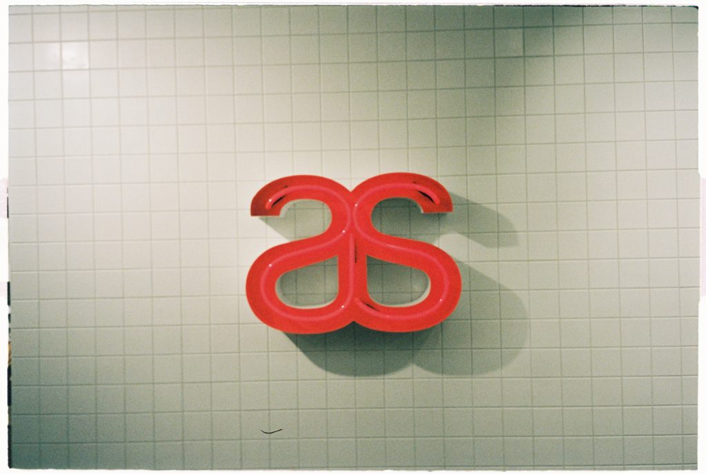
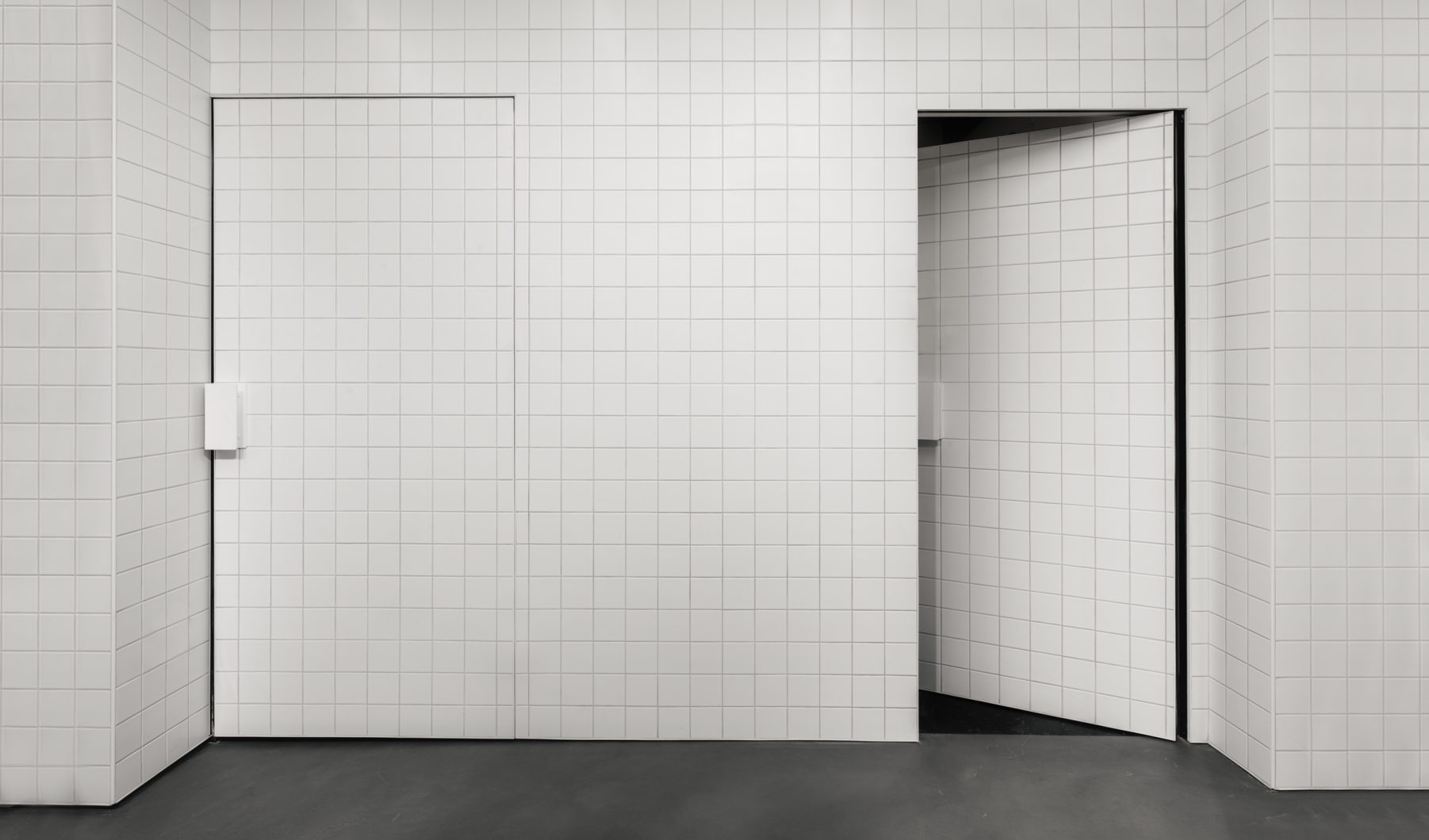
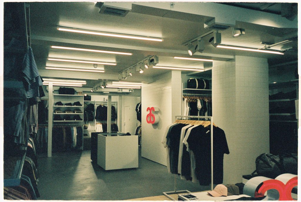
Tiles are a feature of AS Colour’s overall aesthetic to such a level they’re almost quintessential to the brand. Columns and doorways were painstakingly created by carpenters to ensure no tile had to be cut. Cutting tiles would risk a less precise and clean line in the finished result. We tiled the existing doors, but as this made them too heavy, we installed heavy duty SOSS hinges to support them. When tiling the focal point – a large wall emblazoned with the AS Colour logo behind the payment area – the tiles slipped a little while drying, causing an almost unreadable sag. Barely visible to the eye, it was a niggle I had to (literally) straighten out. As painful as it was, all the tiles were removed, and new ones were installed perfectly straight. The finish was sublime.

We also ventured into new territory with a bespoke sealed concrete block bench. We couldn’t source the materials needed for the original design in the UK, so our redesign was crafted by skilled stone masons out of readily available concrete blocks. At Studio Hako, we always have sustainability and eco-friendliness in mind, so when our client wanted us to match a sample of a product they had in New Zealand for the changing room interior panelling, our team did a great job of sourcing a perfect match in all texture, colour and finish. This came in the form of whitewash stained rived oak, which was completed with a heavy duty and cleanable satin finish.
When it came to the floor, the existing surface was in a very bad condition; uneven, rough and crumbled in places. A huge feature to the project and overall aesthetic, it was paramount we did our absolute best to repair it within the timeframe and budget. This was a great opportunity to use Mortex, a product I’d been wanting to use for a while. It’s a coloured mineral covering with a waxed concrete look. When applied, it gave beautiful texture and tone to the otherwise flat colour of the microcement floor, elevating an understated element of the store to a vital and impactful aesthetic feature. Although the original floor didn’t allow us to get it perfectly snooker table smooth, we installed a shadow gap on the wall panels to draw attention away from its slight unevenness. What really balanced the end result was the installation of a natural timber floor at the entrance, making a beautifully stark contrast of warm and cool.
And, finally, a little note to add our love for the custom-made aluminium handles. Designed by Think + Shift, these were crafted by our metalworker, and then powder coated in appliance white. It was the first time working with aluminium in this way, and the finished design had great lightness and texture.
Whenever we embark on a project, communication is always at the forefront. On this occasion, we brought new team members into the studio hako organism, so there were many things to learn in ways of communicating process, system and general working. It’s always something we look out to improve as a vital skill in the industry. That being said, this consistency of interaction ensured the project was delivered on time. AS Colour didn’t actually step foot in the UK until right at the end for handover.
Redchurch Street isn’t just a street. It’s a community. From beautiful restaurants to the fascinating Blue Mountain School nearby, it has a visceral creative and engaging energy which just makes you want to dwell for longer. Whilst working on AS Colour, we made friends with the businesses around us and we’d like to thank every one of them for brightening up our days during the time we spent there. It’s moments like those we relish. AS Colour, too, took a huge leap of faith placing their prized store in our hands, without stepping foot in the UK until right at the end for handover. It’s clear from working with them that being able to build good relationships, whether it’s from suppliers, designers or craftsmen, is vitally important. It was a privilege for us to create a base for them.
AS Colour sits on Redchurch Street, a bolt of white framed by rusted metal. An ecologically transparent store, it suited the space to have wide doors, wide windows, pure light, and a sense of space. It’s like looking into a bright future or a blank canvas. A very beautiful and hopeful beginning.