HAKO CARRÉS 2
Hako Carrés: A favourite object selected by furniture maker Piers Peel
Studio Hako – What is it about this object that you like?
Piers Peel – I think it comes from its simplicity, it’s useful and so simple, just one band and one stick, materials you could almost find anywhere.
Studio Hako – Does it have a personal meaning to you, as well?
Piers Peel – Some, my favourite tutor at college gave it to me. Which was really nice – and I don’t know why – but she did the woodturning and that was the bit of the course I really enjoyed and so she gave it to me one day. That meant alot. Since, it’s always sat in the workshop with me.
Studio Hako – And having it with you in the workshop, what does that mean to you? Is it inspirational?
Piers Peel – When I’m designing, I can tend to over complicated things, to use intricate joinery to make something look nicer. Having this in view is a good reminder that you don’t always need all that, that it can just be an object that works, and that’s enough. There’s a beauty in that.
HAKO CARRÉS 1
Hako Carrés: The Cabmen’s Shelter on Russel Square.
An overlooked building chosen by Anthony Engi Meacock of Assemble.
Our first edition in a series of visual articles with friends, colleagues and collaborators sees Studio Hako asking Anthony Engi Meacock to select and tell us about a favourite overlooked building or structure.
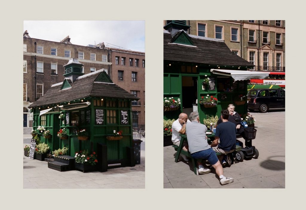
His choice of the Cabmen’s Shelter on Russel Square is a wonderful example of a piece of human-centered architecture that serves its purpose in an un-showy but dignified way, providing a restorative and convivial space for Hackney cab drivers on the edge of a large, park-like square in London.
“This Cabmen’s Shelter is one of 13 left of an original network of 61 across London commissioned by the Cabmen’s Shelter Fund to provide simple food and drink to London’s cab drivers. There is something wonderfully enigmatic about them – but for me they also represent a generous approach to public space and a care towards workers that we would do well to learn from. It’s hard to imagine a similar network for Uber or Deliveroo drivers.” — Anthony Engi Meacock
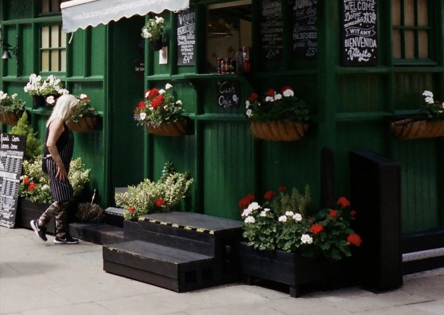
When Studio Hako went to visit the Shelter, we found it surrounded by flowers. This, along with the Shelter’s bright-green paint and whimsical roof turret, suggests vernacular-influenced Arts & Crafts architecture, with its tendency to point towards nature even in the heart of the city. This return to the natural is close to the heart of Studio Hako’s approach: today we want to bring nature into the urban context through the use of quality, natural materials in our projects.
aprés anora: mix
Guest mix:
Impermanence by Après Anora,
Jan. 2021
shadows project
the sudden appearance
of unexpected perspectives
contrasts rich in relationships
between old and new
unthinkable
cosmic magnitude
a liminal space
through the mysterious barricade
rachel boston: project story
Not all who wander are lost, and those who do stray from the beaten path are often rewarded. Steer off bustling Brick Lane, and you will come upon Rachel Boston’s artisan jewellery showroom slotted into a narrow Victorian terrace on Cheshire Street. Interior designer Hollie Bowden invited Studio Hako onboard for a complete refurbishment to reflect Rachel’s growing business.
Despite its small size, the space demanded a long list of requirements from demolition, joinery, stonework and carpentry to electrical and plumbing work, upholstery, decoration and flooring. A part of Studio Hako’s philosophy is rooted in Wabi Sabi, a careful balance of imperfection, subtlety and simplicity. Rachel’s yearn for a considered space fell seamlessly into this aesthetic, completed by Hollie’s choice of grounding, earthy materials and textures. Only expert delicacy and precision could happily balance places for clients to sit and stand, a desk, payment area and jewellery display without it becoming crowded. Flow was vital, allowing movement of both eye and body, where every element played its role to cumulate into a quiet symphonic experience.

Limited on space for decorative accents, Hollie made a feature of the walls by using natural clay plaster. This was a first for us, a process which took longer than expected, but ultimately only extended the project a little. On its completion, light catches in the rough texture and, at some angles, seems to swirl like clouds with ever-undulating earthy tones.
This carried through into the natural silver stone travertine window display. A thing of beauty in itself, we wanted to preserve it in its flawless splendour. To avoid cracks or breakages, we used one of the latest materials called wedi board. Waterproof and weatherproof, it’s also very rigid and won’t warp. Not to mention it’s also surprisingly lightweight for its purpose as a solid sub structure.


Many accents had dual purposes in their look and practicality, such as a bespoke curved sofa filling a previously difficult and, consequently, dead, space. One of my personal favourites is the raw silk screen. Hanging from a fixture on the ceiling, we crafted a sliding dovetail baton in American walnut so it could slide on and off whenever the fabric needed changing or cleaning.
A showroom based around heirlooms, such as engagement and wedding rings, it’s a space that requires a particular gentleness and warmth. An intrinsic beauty imbues the clay plaster walls, raw silk screen, rough sawn timber desk, and the original rustic timber floor. Every grain of wood and crackle of stone is openly accentuated with understated reverence. As with every place we construct, we cherish long- lasting and high-quality materials that improve with age or are repairable. Rachel’s flourishing business tightened our timeframe for completion, as the showroom could only be closed for a short while. We always have multiple ongoing projects that demand attention, but with good scheduling, management and communication we were able to reach the deadline. It’s a dance we all know quite well by now.

That being said, old buildings, in all their magnificence and beauty, do seem to enjoy trying to fling a spanner in the works. Not only was the place hard to access and work in due to its size, our team of electricians had their work cut out for them with the sensitive and crucial security system. Our original plan to fill the gaps in the existing floors with seasoned timber fillets and sand to a fine finish before being painted was completely scuppered once the dirt was removed. It became clear the boards were in fact tongue and groove and not butt jointed, meaning the gaps needed filler instead. Old floors move a lot, and using filler was risky. Not wanting to compromise finish, we took the time to reduce movement where possible and completed the floor in Farrow and Ball’s tanners brown. The striking depth of its colour propels light up to the ceiling.
An amalgamation of impeccable planning, a dedicated team and a cooperative and understanding client allowed us to overcome every challenge. Rachel’s project presented a chance to connect and work with an amazing client, with Hollie Bowden and her team, and an opportunity for the hako team to work and grow together on something we each felt passionately about.

ascolour: project story
There’s beauty and perfection in basic things: the smooth contour of a wall, the soft grain of wooden floorboards, even the way the light through the window changes the feel of the interior. So much pleasure can be received from a simple thing, and, above all, a simple thing done well.
In 2006, Lawrence Railton founded AS Colour in New Zealand, where they are still based. Now a global retailer, their organic cotton basics are renowned and respected, not only for their high quality, but for their ethical standing, too. Their cotton is responsibly and 100% transparently sourced, and they have a zero- tolerance position on bonded labour.
It came as no surprise, then, when Studio Hako was introduced to AS Colour by a mutual friend, that the two clicked together. Both ethically and sustainably minded, their uncompromising ideals combined seamlessly with a similar love of clean aesthetics, precise workmanship and attention to detail and finish.
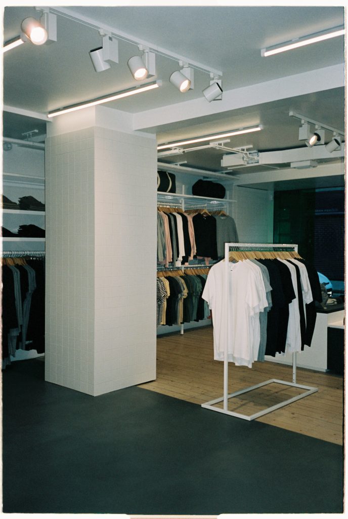
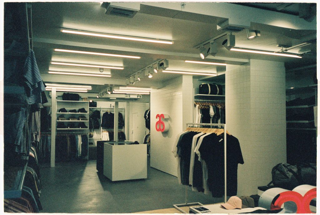
AS Colour’s inaugural UK store would be based in the sought-after Redchurch Street in Shoreditch, London. With both the owners and designer, Think + Shift, on the other side of the world, most communication went ahead via technology. They wouldn’t, in fact, come to the UK until the project was completed for handover, but it didn’t stop us quickly creating a firm bond over the months we worked together. They wanted a bright, fresh and minimal space, quite the opposite to how the shop’s predecessor, T2, had left it. Mostly black with a few orange details, it had a low ceiling, making an oppressive cave-like atmosphere. It was a pleasure just to restore some breathing space back into its walls.
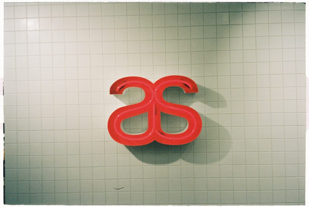
Tiles are a feature of AS Colour’s overall aesthetic to such a level they’re almost quintessential to the brand. Columns and doorways were painstakingly created by carpenters to ensure no tile had to be cut. Cutting tiles would risk a less precise and clean line in the finished result. We tiled the existing doors, but as this made them too heavy, we installed heavy duty SOSS hinges to support them. When tiling the focal point – a large wall emblazoned with the AS Colour logo behind the payment area – the tiles slipped a little while drying, causing an almost unreadable sag. Barely visible to the eye, it was a niggle I had to (literally) straighten out. As painful as it was, all the tiles were removed, and new ones were installed perfectly straight. The finish was sublime.

We also ventured into new territory with a bespoke sealed concrete block bench. We couldn’t source the materials needed for the original design in the UK, so our redesign was crafted by skilled stone masons out of readily available concrete blocks. At Studio Hako, we always have sustainability and eco-friendliness in mind, so when our client wanted us to match a sample of a product they had in New Zealand for the changing room interior panelling, our team did a great job of sourcing a perfect match in all texture, colour and finish. This came in the form of whitewash stained rived oak, which was completed with a heavy duty and cleanable satin finish.
When it came to the floor, the existing surface was in a very bad condition; uneven, rough and crumbled in places. A huge feature to the project and overall aesthetic, it was paramount we did our absolute best to repair it within the timeframe and budget. This was a great opportunity to use Mortex, a product I’d been wanting to use for a while. It’s a coloured mineral covering with a waxed concrete look. When applied, it gave beautiful texture and tone to the otherwise flat colour of the microcement floor, elevating an understated element of the store to a vital and impactful aesthetic feature. Although the original floor didn’t allow us to get it perfectly snooker table smooth, we installed a shadow gap on the wall panels to draw attention away from its slight unevenness. What really balanced the end result was the installation of a natural timber floor at the entrance, making a beautifully stark contrast of warm and cool.
And, finally, a little note to add our love for the custom-made aluminium handles. Designed by Think + Shift, these were crafted by our metalworker, and then powder coated in appliance white. It was the first time working with aluminium in this way, and the finished design had great lightness and texture.
Whenever we embark on a project, communication is always at the forefront. On this occasion, we brought new team members into the studio hako organism, so there were many things to learn in ways of communicating process, system and general working. It’s always something we look out to improve as a vital skill in the industry. That being said, this consistency of interaction ensured the project was delivered on time. AS Colour didn’t actually step foot in the UK until right at the end for handover.
Redchurch Street isn’t just a street. It’s a community. From beautiful restaurants to the fascinating Blue Mountain School nearby, it has a visceral creative and engaging energy which just makes you want to dwell for longer. Whilst working on AS Colour, we made friends with the businesses around us and we’d like to thank every one of them for brightening up our days during the time we spent there. It’s moments like those we relish. AS Colour, too, took a huge leap of faith placing their prized store in our hands, without stepping foot in the UK until right at the end for handover. It’s clear from working with them that being able to build good relationships, whether it’s from suppliers, designers or craftsmen, is vitally important. It was a privilege for us to create a base for them.
AS Colour sits on Redchurch Street, a bolt of white framed by rusted metal. An ecologically transparent store, it suited the space to have wide doors, wide windows, pure light, and a sense of space. It’s like looking into a bright future or a blank canvas. A very beautiful and hopeful beginning.